
I've been working on their graduation announcements, and I need some advice.
In design, critiques are always a good idea. Especially for me, because once I stare at something for a certain amount of time, I lose touch with reality, and I forget what actually looks good. Plus, the twins and I are one very indecisive bunch, and we can't decide which ones we like best.
So we are going to have a fun little voting party. Tori, Tara, and Kelsie [if you read my blog], please give me some advice on how I can improve! Everyone else, Leave a comment with your favorites for both Valerie and Vanessa, and feel free to tell me what you think should change.
If you want to look closer, click to enlarge.
[Remember, these are drafts, not finals, so I still have some things to fix]
Let the voting begin!

Vanessa #1


Vanessa #3
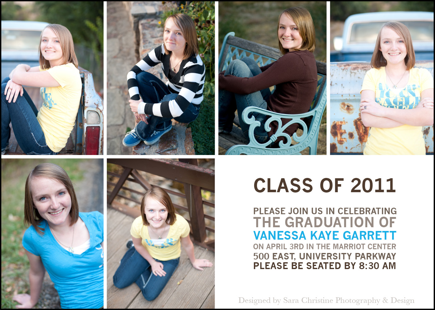
Vanessa #4

Val #1

Val #2


Val #2

Val #3

Val #4
p.s. there isn't a black border, I just put that in to show you where the edges are.

Val #4
p.s. there isn't a black border, I just put that in to show you where the edges are.
Thanks for helping us out! :)
If you are interested in getting your own personalized Grad announcement (high school or college), shoot me an email: sara.tranberg.1@gmail.com. I'll be happy to discuss style and pricing options.
If you are interested in getting your own personalized Grad announcement (high school or college), shoot me an email: sara.tranberg.1@gmail.com. I'll be happy to discuss style and pricing options.
10 comments:
Well For mine I like numbers 1 and 3. I am kinda leaning towards 1. For Vals I like 2 and 3 and 4. haha. I have problems making choices!
My YW Leader likes 4 on my and 3 on Vals. haha
I like 2 on Nessa's and 1 and 3 for Val. You are so talented! I love them all!
Number 3 for both. Is graduation really April 3 or is supposed to be June?
Its suppose to be June. Some say April & some say June. I'll fix them later :)
I love 4 for both the girls! it's so freakin cute sara!!
I like number 3 for Val and 2 for Vanessa :) These are really good, Sara!
With number 2, I like how everything fits within the grid, but maybe you could make it so that the picture and the text on the right were centered so there was equal space above the picture and below the text. Maybe you could just see how that worked.
And with number 3, I think it might look good with less space above and below the name. With the class of 2011, it's a little difficult to read, and it makes you work harder, so maybe you could put that up top with the name of the high school?
With both of them, maybe if there was other important information, like the date and time, you could highlight that by making it the accent color, just because there is a quite a bit of text shoved into one space.
Haha, I feel like I'm in type again!
But like I said, I think they're really good! I just thought I'd give you a real critique to help you out :) Heaven knows how much we love them :) haha.
I like numbers 2 and 4 for Vanessa. Opposite of her! And I like numbers 1 and 4 for Valerie.
And I'm glad I found your blog!
I think they're all really cute, Sara! You've done a great job! Please let me proofread the final choices so I can make sure the text is right before the final printing, ok? Also, I wanted to put in a good word for Rachel Call. She took Vanessa's pictures and did a wonderful job. Thanks Rachel!
Love, Mom
For Valerie I love number 1. I wouldn't change a thing!
And for Vanessa I love number 4! I think it would also be cute if you changed the 4 left pictures and put just one, and left the 2 smaller ones on the right. So there would be 3 total. I feel like there's maybe too many pictures since it's on a post-card sized paper, right? I love it how it is though too!
Goo job Sara, these are so cute!
Post a Comment